Same Race, Different Experience: Why Platform Design Matters in Formula 1 Content
F1 NewsFriday, 12 June 2026 at 06:06
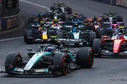
Most fans look at the headline appeal of Formula 1 as the beginning and end of their decision to watch, read or follow a race weekend. They might initially be attracted to a famous driver, a dramatic circuit, a title battle or a viral onboard clip.
What is easy to overlook is that the platform presenting that F1 content shapes almost everything around it. It influences how clearly key information is shown, how race coverage is grouped, and how confident a fan feels before they even commit to watching highlights, reading analysis or following live updates.
A great race on a poorly organised site can be harder to understand or easier to miss, while the same Grand Prix coverage on an intuitive platform often feels more accessible from the first click.
When surrounding information creates friction, fans have to dig through cluttered menus, unclear schedules and scattered articles just to understand what matters. Eventually, that disorganisation can reduce engagement and push readers toward a cleaner source.
Depending on how a race, driver story or team update is presented and contextualised, a fan can go from “I need to follow this” to “I’ll check it somewhere else” in a matter of seconds.
How F1 Discovery Is Influenced by Platform Design
The discovery phase is often treated as the step between landing on a site and choosing what to read or watch, but it is much more than that. It is the stage where fans begin forming opinions.
The way race previews, driver profiles, technical explainers and team news are grouped guides attention immediately, which is why a clean and intuitive discovery process matters so much. In the worst case, even strong F1 content can disappear into the background.
Well-organised motorsport sections make it easy to explore by team, driver, circuit, race weekend, championship standings, strategy, technical updates or latest news. The more structure there is, and the easier it is to cut through stories a fan is not interested in, the more effectively the platform can guide people through the content library.
Discovery should work across multiple entry points. For example, a fan might first see a rotating “Race Weekend Hub” at the top, followed by rows like “Qualifying Analysis”, “Strategy Watch” and “Driver Market Updates” to pull attention in slightly different directions.
A major story about Max Verstappen, Lewis Hamilton or Ferrari might appear in both a featured carousel and a trending section, so it gets repeated visibility without the fan needing to search for it.
The same concept applies beyond motorsport as well. Structured category pages, such as CasinoHawks’ online slots section, show how large libraries can be broken into clear groups so users are not forced to search blindly.
For F1 publishers, the equivalent might be separating race previews, driver news, technical analysis and standings updates so fans can quickly pinpoint the coverage most relevant to them.
Why Strong F1 Content Alone Does Not Guarantee a Good Experience
Strong Formula 1 coverage might offer sharp analysis, fast updates or high-quality visuals, but it does not automatically translate into a stronger fan experience. Because that content sits inside a wider platform, the environment can either support the story or get in the way.
That is why two sites can cover the same race weekend but feel completely different to use. The overall experience of finding, understanding and following F1 content can determine whether it actually gets consumed.
If publishers make sure that fans can discover a race preview, click through in seconds and understand the key context almost immediately, that encourages deeper engagement. If the article is only accessible through a long chronological feed or buried under a broad sports category, interest can fade quickly.
The phrase “it is about the journey, not the destination” applies well to F1 content discovery, because the path to the story matters almost as much as the story itself.
How Curation Influences Trust
Another byproduct of good platform organisation is trust. While the way articles, clips and live updates are grouped is important from a practical perspective, it also sends subtle signals about whether a site feels intentional or careless.
When a Formula 1 section feels curated, it suggests the platform is actively maintaining its coverage rather than simply filling space. Thoughtful sections help create the sense that the site is current, knowledgeable and paying attention to what fans are actually following.
In turn, this affects how credible the platform feels. Intentional curation builds confidence that the publisher understands the sport and knows how fans move through a race weekend.
It is comparable to how Netflix features personalised rows or how Spotify builds curated playlists like Discover Weekly, as well as the annual Spotify Wrapped experience. The product is not only the content itself; it is also the way that content is arranged, resurfaced and made relevant.
What Defines an Effective Formula 1 Section
Fans often associate a useful motorsport section with the volume of stories available. However, what makes it effective is how easily those stories can be navigated.
The best platforms remove unnecessary friction from the browsing process, so readers can move from interest to understanding without struggling to find basic information such as session times, race order, tyre strategy, championship points or team context.
A few practical design choices can make a Formula 1 section much stronger. Clear grouping helps fans spot what type of coverage they are looking at, often supported by visible signals such as latest updates, editor picks, race-weekend labels or team tags.
Filters should narrow results in a meaningful way, rather than simply reshuffling a large list of posts or existing only for show.
The Impact of Presentation on Race and Story Selection
Device compatibility is also essential. F1 audiences often check updates during commutes, between sessions or while watching live coverage on another screen. On smartphones and tablets, cluttered layouts or poor spacing can turn even simple actions into a frustrating experience.
Much like a store can make products easier to notice, compare and choose without changing the products themselves, a publisher can make F1 stories easier to discover, understand and follow without changing the substance of the reporting.
Presentation does not only refer to aesthetics. Many parts of presentation change how fans behave on a platform, including the clarity of key details and what information is made visible upfront. They influence how quickly a decision is made and how confident that decision feels.
When details like session timing, starting grid position, tyre choices, penalty information and championship implications are easy to spot at a glance, fans do not have to spend as much time figuring out whether a story is relevant to them.
With decision-making sped up, the choice feels more straightforward. A clearly presented race preview or analysis piece also feels more approachable because the reader already has important context before they start.
Reading High-Quality Reviews and Analysis for Better Decisions
Without that context, F1 coverage can feel overwhelming, especially for newer fans who may know the teams and drivers but not the strategic details behind a race weekend.
Race selection is only one part of what fans are looking for. Because a real rundown of the platform, the coverage style and the stories themselves is so important, readers often turn to comparison and review-style resources to make sense of what is worth their time.
In the same way that a site that compares and reviews casinos can shape expectations before a user chooses a platform, a motorsport publication that compares race coverage, driver analysis or team-focused reporting can shape expectations before a fan commits to following a source regularly.
The Real Importance of Platform Quality in F1 Discovery and Engagement
But not every review or analysis site will do. When coverage is shallow, overly generic or written mainly to chase attention, it does not help fans distinguish between meaningful stories and noise.
In contrast, specific and well-written analysis explains how a race developed, why a strategy worked, what a team update means and which narratives are actually worth following. Rather than simply summarising events, strong coverage frames them and adds extra layers of trust and clarity.
No publisher or fan wants to hear that strong Formula 1 content alone is not enough. But the reality is that the same race story can feel meaningfully different depending on the platform presenting it.
Because presentation and curation are integral to how F1 content is experienced, the quality of the platform becomes part of the product in practice. The site does not just host the coverage; it helps decide how successful that coverage becomes.
Latest News


Loading