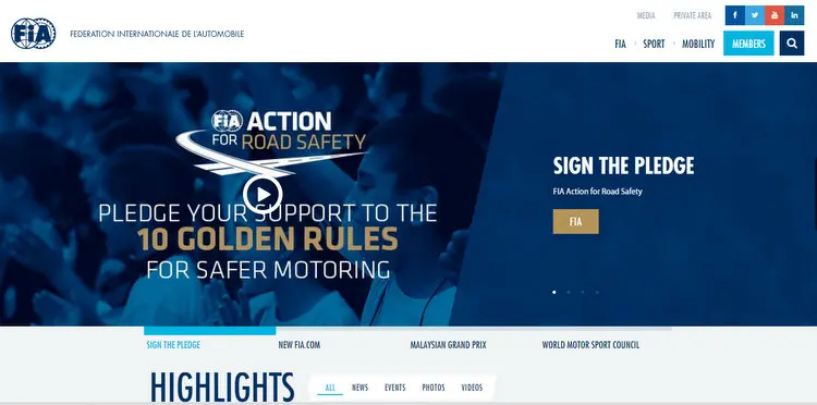
FIA have launched an upgraded website which looks distinctly amateurish, with out of focus image, text reports converted to images and clumsy navigation.
The sport's governing body is clearly proud of their creation as they trumpeted, "In order to make navigation of the FIA’s vast world of motoring and motor sports as intuitive as possible, we’ve refreshed the whole look and feel of the site."
Clearly deluded they added, "To do this we’ve brought in a dynamic, linear page style that firmly puts the focus on exclusive video content, world-class photography and seamless social media integration."
"Whether you’re a fan of racing, rallying or road cars, the FIA’s new site has also been built for you to get involved. Quick and easy interaction is set to allow fans to have their voice heard by the people who make motor sport happen," obviously ignoring how impractical navigating the labyrinth actually is.
"The new FIA.com represents a major leap forward, opening up a whole new world of motor sport action and motoring excitement to fans worldwide," they added with their heads clearly in the sand.
Obviously the people who commissioned the website also appear to be tasked with boasting about it's capabilities, alas the new portal falls severely short of modern web standards and is hardly going to attract a younger generation of visitors to the portal.
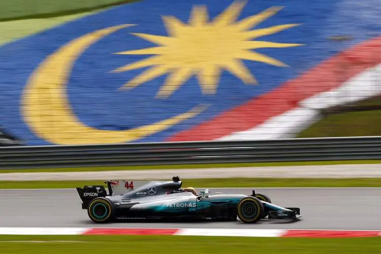
How bad is this?>>>> - a blurry image substituting for text previewing the Malaysian Grand Prix!
Latest News


Loading